Blocky and Proud: How Bitmap Fonts Went From Technical Accident to Design Statement
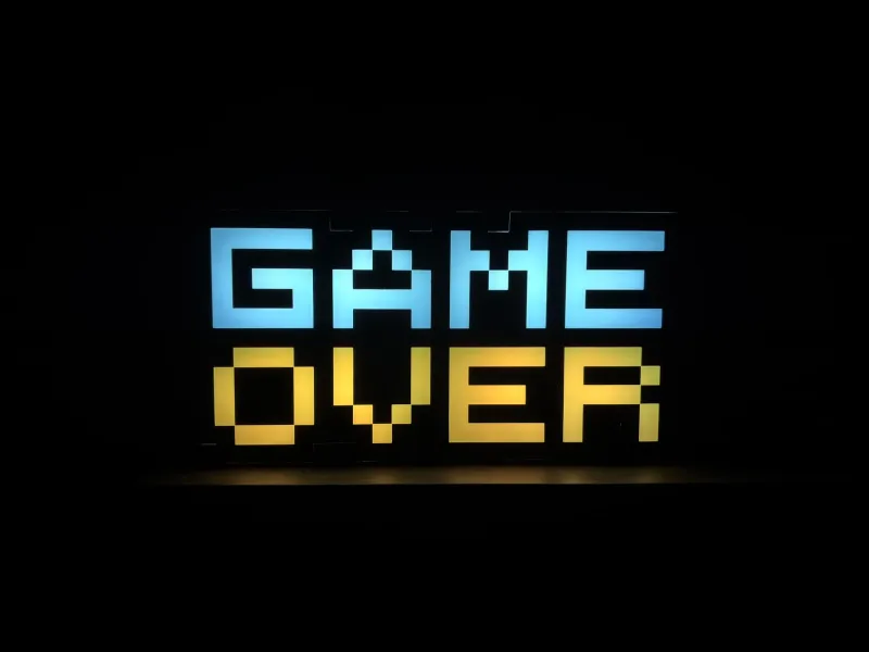
There's something almost funny about the trajectory. The typefaces that early computer engineers cobbled together because they had no other choice — cramped into 8x8 pixel grids, aliased hard at the edges, incapable of curves in any meaningful sense — are now being licensed by fashion labels, tattooed on forearms, and screen-printed on limited-edition sneakers. Bitmap fonts, the typographic equivalent of a happy accident, have become one of the most deliberate design choices a creative can make in 2024.
So what happened? And why does a blocky string of letters that looks like it belongs on a Game Boy cartridge screen suddenly feel so loaded with meaning?
Born From the Box, Not the Drawing Board
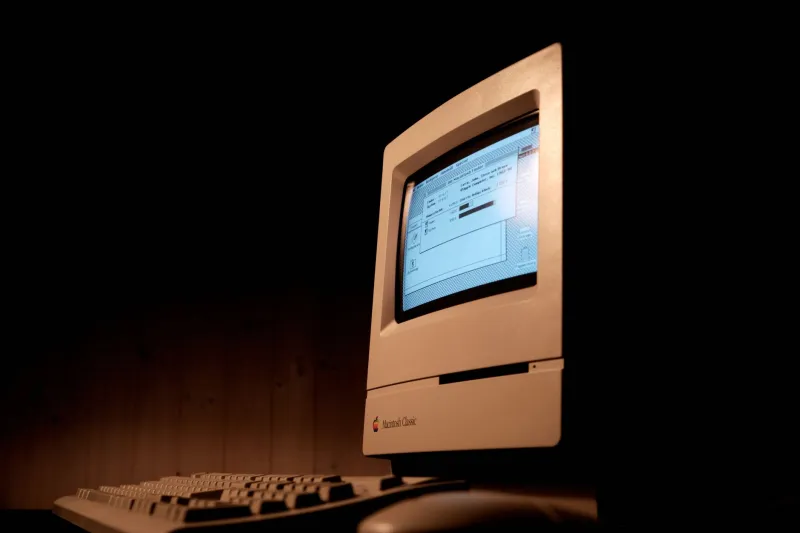
To understand why these fonts hit different now, you have to go back to where they came from. Early personal computers — your Apple IIs, your Commodore 64s, your original IBM PCs — rendered text on screen by mapping characters to fixed pixel grids. There was no anti-aliasing, no vector scaling, no optical kerning. A letter was a pattern of lit and unlit dots, full stop.
Designers and engineers working in that environment weren't making aesthetic choices so much as solving math problems. How do you fit a legible capital 'M' into a 7-pixel-wide column? How do you suggest the curve of a lowercase 'a' when your only tools are squares? The results were ingenious in their constraints — letterforms that communicated despite their limitations, sometimes even because of them.
Fonts like Chicago, Monaco, and the unnamed system typefaces baked into early home computers became the visual texture of an entire era of American digital life. If you grew up booting a family PC in the late '80s or early '90s, those letterforms are practically hardwired into your memory.
The Nostalgia Isn't the Whole Story
Here's where it gets interesting, though. Reducing the bitmap font revival to pure nostalgia is a little too easy. Sure, there's a generational comfort factor — plenty of millennials get a warm, fuzzy gut reaction from seeing that chunky pixelated text. But the designers actually driving this trend aren't always the ones who grew up with it.
A significant chunk of the indie game developers, graphic designers, and brand creatives championing bitmap aesthetics right now are Gen Z — people who didn't live through the dial-up era firsthand but have absorbed it through emulation, YouTube archival footage, and the general cultural osmosis of growing up online. For them, the appeal isn't memory. It's posture.
Bitmap fonts read as anti-algorithmic. In a design landscape increasingly dominated by smooth, rounded, endlessly optimized UI typefaces — the kind A/B-tested into blandness by tech giants — a deliberately pixelated font is almost an act of defiance. It says: this was made by a human working within limits, not by a committee chasing engagement metrics.
From Indie Games to Gucci Adjacent
The clearest evidence of bitmap fonts' cultural ascent is where they've been showing up lately. Indie game development has been the heartland of the aesthetic for years — titles like Undertale, Celeste, and Shovel Knight all leaned hard into pixel typography as part of a broader visual vocabulary that felt intentional rather than imitative. These weren't games that used chunky fonts because they couldn't afford better. They used them because those fonts meant something.
But the drift into mainstream and high-end design has been something else entirely. Streetwear brands started incorporating bitmap lettering into logo treatments around the mid-2010s, and the trend has only accelerated. You'll find it on limited-run apparel drops, in the branding of certain craft beverage companies, and — perhaps most surprisingly — edging into luxury fashion campaign typography, where the rough-edged pixel grid sits in deliberate, provocative contrast against glossy product photography.
There's a whole sub-genre of contemporary graphic design that plays exactly this tension: the collision between high-polish production values and deliberately lo-fi typography. The bitmap font becomes the signal of authenticity in an otherwise flawless image.
The Craft Inside the Constraint
One thing that gets lost in conversations about this trend is how technically demanding good bitmap font design actually is. Modern type designers working in this space aren't just slapping a pixelate filter on an existing typeface. Creating a bitmap font that's genuinely readable, characterful, and scalable across different pixel densities is a discipline with its own deep body of knowledge.
Designers like Yuji Oshimoto and foundries like Authentic Weather have spent real time developing pixel-native typefaces that hold up under scrutiny. The challenge is the same one those early engineers faced: how do you make something legible, expressive, and visually coherent when your fundamental unit is a square? Solving that problem well in 2024, when you could just use a vector font, is a genuine creative statement.
There are even dedicated tools and communities built around the craft — from specialized bitmap font editors to Discord servers where designers swap techniques for handling diagonal lines (always the trickiest part) and discuss the ethics of referencing vintage system fonts without directly copying them.
Why They Hit Different on a Screen
There's also something worth noting about how bitmap fonts perform in specifically digital contexts, which is where most of us encounter them. On a screen, a well-made pixel font has a kind of visual honesty that smooth vector type doesn't. It acknowledges the fundamental nature of the medium — the fact that everything you're looking at is, at some level of zoom, a grid of colored squares. Bitmap type stops pretending otherwise.
That transparency resonates. In an era when digital design is obsessed with simulating physical texture, depth, and material reality, a font that leans into its own screenness feels almost radical. It's not trying to be anything other than what it is.
The Aesthetic Isn't Going Anywhere
Fads in graphic design come and go fast, especially ones with a strong nostalgia component. But there are a few reasons to think bitmap fonts have more staying power than your average retro trend. The underlying design logic — constraint as creativity, lo-fi as authenticity signal, pixel-native honesty in a digital medium — is substantive enough to survive the initial wave of trend-chasing.
The indie game scene, which functions as a kind of long-term cultural incubator for pixel aesthetics broadly, shows no signs of abandoning the look. And as more Gen Z designers come up through that world and carry its visual sensibility into commercial work, the influence is going to keep bleeding outward.
Bitmap fonts started as a technical workaround. They became the visual language of a generation's digital childhood. Now they're a design philosophy — blocky, deliberate, and making no apologies for the squares.