Frozen in Time: Why the Floppy Disk Icon Refuses to Die
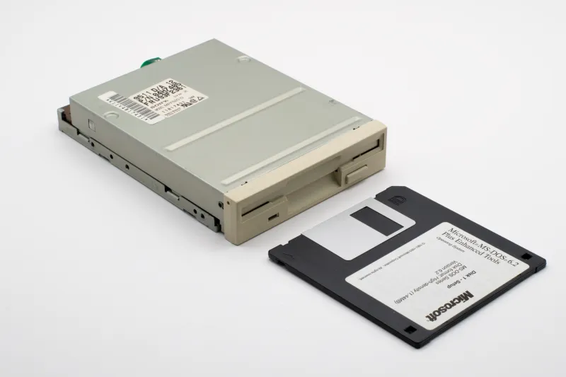
Somewhere right now, a sixteen-year-old is clicking a small square icon to save their homework. They probably don't think twice about it. The icon is just there, the way a stop sign is just there — obvious, universal, unquestioned. But that little square image is actually a photograph of a storage medium that was already on life support before that sixteen-year-old was born. The floppy disk. Gone from shelves. Gone from drives. Gone from basically everywhere except, somehow, the one place it matters most.
It still means save. It always has. And nobody seems to want to change that.
A Symbol That Outlived Its Subject
The 3.5-inch floppy disk had a pretty good run. From its commercial debut in the early 1980s through the late 1990s, it was the dominant portable storage format for personal computers. You backed things up on floppies. You installed software from floppies. You carried your term paper to school on a floppy and prayed it hadn't corrupted overnight.
By the mid-2000s, though, the format was effectively extinct. USB drives had taken over. CD-ROMs had already been eating floppy's lunch for years. Sony — one of the last major manufacturers still producing the things — officially stopped making 3.5-inch floppy disks in 2011. The hardware was gone. The culture around it had evaporated.
The icon, though? The icon stuck around like it owned the place.
Open Microsoft Word today. Open Photoshop. Open virtually any desktop application with a toolbar, and there it is: that flat little rectangle with the sliding metal shutter and the small square cutout in the corner. Pixel-perfect. Unmistakable. And completely divorced from any physical reality a large percentage of users have ever experienced.
"I Thought It Was a Weird Geometric Shape"
We talked to a handful of Gen Z users — folks between eighteen and twenty-four — about what they actually think the save icon looks like. The answers ranged from charming to genuinely surreal.
"I honestly thought it was like, a stylized camera or something," said one college junior from Ohio. "I knew it meant save, obviously. I just never connected it to an actual object."
Another user, a graphic design student in Austin, admitted she'd seen floppy disks in a museum exhibit on computing history. "I recognized the icon from that," she said, "but it felt like seeing a dinosaur bone. Like, oh, that's what that is."
This is the fascinating paradox at the heart of the floppy disk icon's survival: it has become so abstracted from its original meaning that younger users relate to it purely as a symbol — the same way we relate to the @ sign or the hashtag. The referent is irrelevant. The meaning is everything.
Why UX Designers Won't Touch It
So why hasn't anyone replaced it? The design world has had decades to swap in something more contemporary. A cloud icon. A hard drive. An upward-pointing arrow. Any number of things that actually reflect how modern storage works.
The short answer from UX designers is: because it works too well.
"There's this concept in interface design called a 'semiotic anchor,'" explained one senior UX designer who's worked on enterprise software for over a decade. "It's an image so thoroughly associated with a function that replacing it would cause genuine user confusion, even if the replacement is technically more accurate. The floppy disk is the most powerful semiotic anchor in the history of software."
Several designers we spoke with pointed to a failed experiment during the early days of cloud-based productivity tools, when some teams tried introducing a cloud-shaped save icon. User testing was brutal. People understood what a cloud meant in the abstract — syncing, storage, the internet — but they didn't feel the urgency of saving when they saw it. The floppy disk, with its boxy solidity and its suggestion of something physical and permanent, triggered a more immediate response.
"It's almost emotional," one designer told us. "The floppy icon communicates finality. You clicked it, the thing is saved, it's done. A cloud feels... floaty. Like maybe it'll get there eventually."
The Weight of a Dead Object
There's something genuinely poetic about this, if you're willing to go there. The floppy disk icon carries emotional weight that no amount of rational redesign can seem to strip away. It's a ghost that haunts software with benevolent intent.
Software engineers tend to have a more pragmatic take. "Nobody's going to be the person who broke the save button," laughed one backend developer who's been in the industry since the Windows 98 era. "You'd be the most hated engineer on the planet. The icon is load-bearing at this point. It's not worth the risk."
That's only half-joking. Interface conventions, once established, have enormous inertia. The QWERTY keyboard layout was designed partly to prevent mechanical typewriter jams — a problem that hasn't existed for over a century — and yet here we are, still hunting for the Z in the bottom left corner. The floppy disk icon is QWERTY's spiritual cousin: a solution to a problem we no longer have, now so embedded in our muscle memory that removing it would feel like an amputation.
Retro by Accident
What's interesting from RetroPixel's corner of the internet is how the floppy disk icon straddles the line between nostalgia and pure function. Unlike, say, deliberately lo-fi design aesthetics or pixel art revivals — things people choose because they want that vintage feel — the save icon isn't retro on purpose. It just is retro, the same way your grandparents' kitchen wallpaper pattern might just be the one they never got around to changing.
And yet, in certain design circles, there's a growing appreciation for exactly that quality. The icon's refusal to modernize has made it a kind of accidental artifact. Graphic designers have started incorporating it into artwork, merchandise, and branding not because it's functional but because it's culturally loaded. You can find the floppy disk silhouette on enamel pins, embroidered patches, tattoos. It has jumped from interface element to cultural shorthand for an entire era of computing.
"It's like the VHS tape," said the design student from Austin. "You see it and you immediately feel something, even if you weren't really there."
Some Icons Just Earn Their Keep
Maybe the floppy disk icon's real staying power is this: it represents the moment when personal computing became personal. When ordinary people first had something worth saving. Files that belonged to them. Work they didn't want to lose. The floppy disk was the vessel for all of that anxiety and hope, and the icon inherited that meaning whole.
So when you click save — whether you're finishing a novel, a spreadsheet, or a homework assignment — you're participating in a ritual that stretches back forty-plus years. You're pressing a button shaped like something most people have never held in their hands, that points to a concept older than most of the software running on your machine.
The floppy disk doesn't know what it is anymore. But it knows exactly what it means.
And apparently, so do we.