Hurry Up and Wait: The Quiet Revolution Bringing Back the Beauty of the Loading Bar
There's a specific kind of peace that settles over you when you're watching a progress bar fill in. Segment by segment. Pixel by pixel. A little blue rectangle inching its way across a gray trough like it has absolutely nowhere to be. If you grew up in the dial-up era, that image is practically encoded in your DNA. And if you're part of a fast-growing corner of the internet right now, you've probably been chasing that feeling.
Welcome to the quiet revival of the loading bar — one of the most overlooked artifacts of early digital culture, and unexpectedly, one of its most beloved.
The Screen That Made You Sit Still
Before broadband made speed the default, waiting was just part of the deal. You double-clicked something, and the machine told you: hold on, I'm working on it. That chunky progress bar — sometimes striped, sometimes animated with a little crawling caterpillar pattern, sometimes just a plain rectangle filling with color — was the computer's way of keeping you in the loop. It was honest. It was transparent. It was, weirdly, kind of companionable.
For anyone who spent formative years in front of a Windows 95 machine or a beige Macintosh Performa, those loading screens weren't an interruption. They were part of the rhythm. You'd watch a file copy across two floppy drives and feel a genuine sense of anticipation. When the bar hit 100%, there was a small but real satisfaction — the digital equivalent of watching a cake come out of the oven.
Now that everything is instant, that ritual is gone. And people are starting to miss it.
Developers Who Are Deliberately Slowing Down
Here's where it gets interesting. A handful of UX designers and indie developers across the US have started building intentional delays back into their products. Not because their software is slow — but because they've noticed users feel better when they can see progress happening, even if that progress is slightly theatrical.
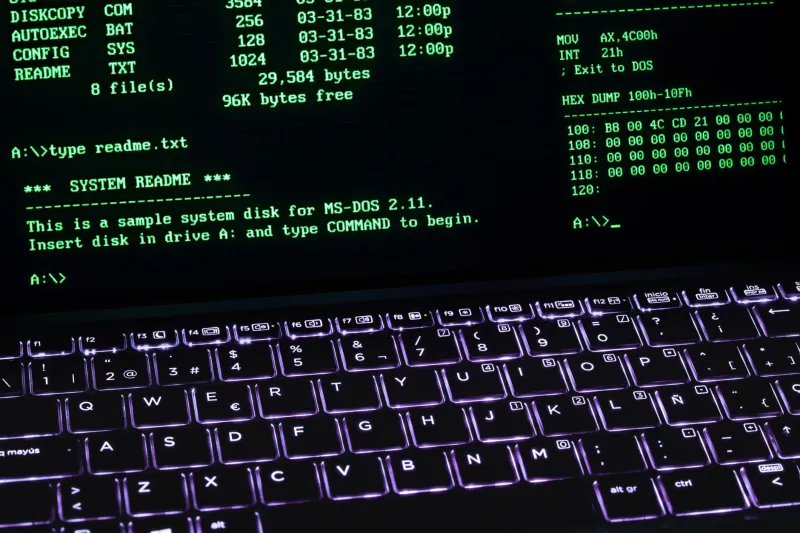
The research behind this isn't new. Studies going back to the early 2000s suggested that a visible progress indicator — even an inaccurate one — made wait times feel shorter and more tolerable. But lately, designers are taking that principle and running with it in a more aesthetic direction. They're crafting loading sequences that are genuinely satisfying to watch. Retro-styled bars with chunky pixel borders. Spinners that pulse in soft gradients. Text readouts that narrate the process like an old DOS boot sequence.
Some apps have even introduced what the community loosely calls "honest loading" — where the interface shows you every micro-step of what it's actually doing. Fetching data. Compiling assets. Rendering components. It's verbose, it's a little nerdy, and users are eating it up.
The Meditation Nobody Asked For
There's a mindfulness angle here that keeps coming up when you talk to people in this space. In a culture where content streams before you've consciously chosen it, where pages pre-load in the background, where the gap between wanting something and having it has essentially collapsed — the loading bar represents a rare moment of enforced patience.
And some people find that genuinely calming.
Digital artists in particular have latched onto this idea. Across platforms like itch.io and even some corners of Tumblr that never quite gave up the ghost, creators are releasing what they're calling "progress pieces" — looping animations built entirely around the visual language of loading. A bar that fills slowly to ambient sound. A spinning cursor that never quite resolves. A download counter that climbs toward completion over the course of an hour.
It's part screensaver, part art installation, part guided breathing exercise. And the audience for it is larger than you'd expect.
One Brooklyn-based artist who goes by the handle Loadstate has been releasing these pieces for about two years. Her most-downloaded work is a simple simulation of a Windows 98-era file transfer dialog, complete with the "time remaining" estimate that jumps from 3 minutes to 47 minutes and back again. She described the appeal in a recent post: "People want to be reminded that things take time. That's not a bug. That's just life."
Nostalgia With a Purpose
What makes this revival different from plain nostalgia is that it's not just about aesthetics — though the aesthetics are definitely part of it. The chunky pixel borders, the muted color palettes, the old-school typefaces on status messages: all of that hits a specific nerve for anyone who came of age in the '90s or early 2000s. But the deeper pull is philosophical.
Instant gratification culture has a fatigue problem. Scroll long enough and everything starts to blur together. The algorithm serves you the next thing before you've finished processing the last one. In that context, a loading bar — something that says wait, just a moment — functions almost like a reset button for your attention.
Game developers have been onto this for a while. Loading screens in classic console games were often packed with tips, lore, or mini-games precisely because designers understood that the pause could be an opportunity rather than a dead zone. Some indie developers today are deliberately reviving that approach, building elaborate little worlds into their load screens that players actually look forward to.
The Bar as a Design Object
It's worth stepping back and appreciating the loading bar as a piece of design in its own right. At its core, it solves a genuinely hard problem: how do you communicate the invisible to a user who can't see inside the machine? The progress bar is a translation layer between computational reality and human perception. It turns abstract processing into something visual, linear, and emotionally legible.
The fact that it often lies — that "time remaining" estimate was always more of a suggestion than a promise — somehow doesn't undermine its appeal. If anything, it makes it more human. The bar does its best. It tries to keep you informed. It just doesn't always have perfect information. Relatable, honestly.
What Comes Next
The loading bar revival is still pretty niche, but the signals are pointing somewhere interesting. As more designers push back against the relentless optimization of interfaces, and as more users consciously seek out slower, more intentional digital experiences, the humble progress indicator starts to look less like a relic and more like a resource.
RetroPixel has covered a lot of ground when it comes to the overlooked gems of early digital culture — the blinking cursor, the screensaver, the bitmap font. The loading bar fits right into that lineage. It's a piece of functional design that outlived its original context and found new meaning on the other side.
Sometimes the best thing a screen can do is make you sit with it for a minute. Let the bar fill. Watch the numbers tick up. Remember that some things are worth waiting for.
Even if the machine made you wait a little longer than it needed to.