Green Screen Dreams: Why Designers Are Falling Back in Love With Monochrome
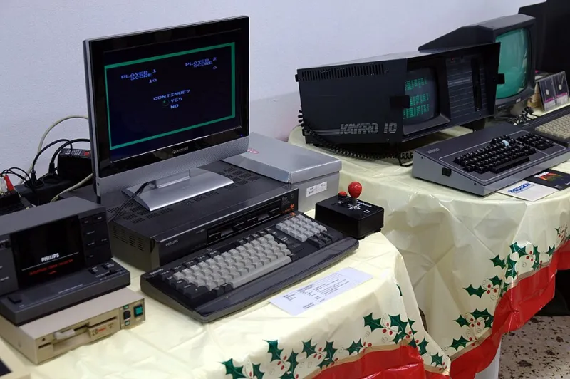
Photo: Soupmeister, CC BY-SA 2.0, via Wikimedia Commons
Open up the App Store on any given afternoon and you'll be bombarded by interfaces that look like they were assembled by a committee of candy manufacturers — gradients bleeding into drop shadows, notification badges in six different colors, icons that seem to be actively competing for your attention. Now imagine the exact opposite of that. A single color. A dark background. Type that looks like it was stamped onto the screen by a machine that doesn't know what feelings are.
That's the direction a surprisingly energetic corner of the design world is heading, and it's not going back.
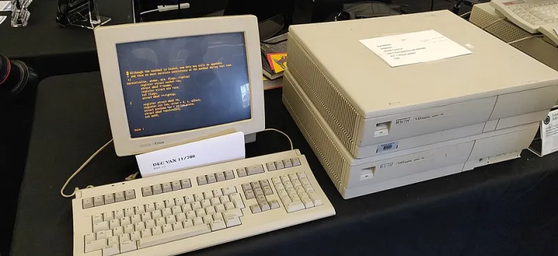
Monochrome aesthetics — interfaces and visual systems built around the constraints of single-color displays, inspired by the amber, green, and white phosphor monitors of the 1980s and early '90s — are having a genuine cultural moment. And the people driving the trend aren't grumpy old-timers pining for their Apple IIe. Many of them are in their twenties, building apps and games and tools that deliberately look like they were made before the color display was invented.
The Vocabulary of Limitation
To understand why this is happening, it helps to spend a few minutes with the source material. Classic monochrome displays weren't just technically limited — they had a visual personality that full-color screens have never quite replicated. The slight bloom of phosphor around bright characters. The way text seemed to glow from inside rather than sit on top of the screen. The absolute clarity of a black background with a single luminous cursor blinking at you.
These weren't accidents of technology. They were the technology, and designers of that era learned to work within them in ways that produced genuinely beautiful results. Think of the clean, purposeful layouts of early Macintosh software, or the stark elegance of a well-designed DOS application. Every pixel carried weight because there were so few of them to spare.
Contemporary designers who are drawn to this aesthetic aren't just copying old screenshots. They're studying the underlying logic — what happens to a design when you remove color as a tool entirely and are forced to communicate hierarchy, emphasis, and emotion through spacing, typography, and contrast alone.
Indie Games Are Leading the Charge
The most visible expression of monochrome design revival is happening in indie game development. Titles like DUSK, Minit, and the pixel-art renaissance more broadly have softened the ground, but a newer cohort of developers is going further, committing to genuine single-palette aesthetics rather than just low-resolution art.
Take games like Caves of Qud — which uses a text-heavy, terminal-inspired interface that would have looked at home on an IBM PC/XT — or the wave of dungeon crawlers and text adventures that have emerged on platforms like itch.io specifically because that platform's culture rewards creative risk-taking over commercial polish. Developers in these spaces talk about monochrome not as a limitation they're working around but as a deliberate choice that shapes everything from level design to narrative tone.
"When you take color away, the player has to slow down," one indie developer explained in a popular thread on a game design forum last year. "They actually read things. They notice details. It changes the relationship between the player and the world."
That observation points to something deeper than aesthetics — it's about pacing, attention, and what a visual environment implicitly asks of the person experiencing it.
The App World Catches On
Beyond gaming, the monochrome impulse is showing up in productivity software, note-taking apps, and writing tools — categories where the argument for visual simplicity is easy to make. Apps like iA Writer have built entire brand identities around typographic minimalism. But some developers are going further, building interfaces that explicitly evoke terminal aesthetics, complete with monospaced fonts, cursor animations, and color schemes pulled straight from the CRT era.
The writing app Drafts, various terminal-inspired to-do list apps, and a whole ecosystem of "distraction-free" tools have found enthusiastic audiences among users who describe them in almost therapeutic terms. "I open it and my brain just goes quiet," is a sentiment that appears over and over in app reviews. The visual noise of modern software, it turns out, carries a cognitive cost that many users didn't notice until something came along that didn't charge it.
For Gen Z designers in particular — a demographic that grew up surrounded by maximalist digital environments and is now entering the workforce — monochrome aesthetics represent something almost countercultural. In a professional landscape where "more" has been the default setting for two decades, choosing less is a statement.
Authenticity as Design Value
There's a philosophical thread running through all of this that's worth pulling on. The current design mainstream — characterized by gradients, glassmorphism, elaborate micro-animations, and color systems with hundreds of variables — is extraordinarily capable. Modern design tools can produce almost anything. And yet, for a growing number of practitioners, that freedom has started to feel like a trap.
When everything is possible, nothing is meaningful. Monochrome design imposes a discipline that forces every decision to matter. The choice of where to put a line of text, how much space to leave around it, whether to make it brighter or dimmer — these become load-bearing decisions in a way they simply aren't when you have a full palette to fall back on.
This mirrors conversations happening in other creative fields — the resurgence of film photography, the embrace of analog recording techniques in music production, the renewed interest in hand-lettering and letterpress printing. In each case, the constraint isn't the point. The constraint is the tool.
What the Green Screen Knows
There's something almost poetic about the fact that the visual language of some of computing's most limited hardware has become a design aspiration for people building software on machines of extraordinary power. A modern MacBook Pro could render photorealistic environments in real time, and a developer is choosing to use it to make something that looks like a 1984 terminal.
That choice is a kind of argument — about what interfaces are for, about what we want from the digital spaces we spend our lives in, about whether clarity and focus are worth more than spectacle.
The green screen doesn't dazzle you. It just tells you what it needs to tell you, and then it waits. In 2024, that's starting to sound pretty good.